Question 1:
In what ways does your media product use, develop or challenge forms and conventions of real media products?

My film follows a linear narrative, with the films events running in chronological order from start to finish. The beginning starts with the characters meeting together at the house and it ends with the lights shutting off after the characters have been messing around with the Ouija board.
Most horror and paranormal horror films I have watched and researched follow a linear storyline whilst some follow a non-linear. Most non-linear horror films start with a suspenseful and climatic event and then cut back in time to show the events leading up to that, giving the audience prior knowledge, whereas a linear horror is shown in chronological order. For our film, we chose to follow a restricted and linear narrative in order to keep the audience on the edge of their seat and to ensure that they and unbeknown to the events that are going to unfold throughout the film. Horror films can be very action packed and fast paced and I believe that having a linear narrative instead of a non-linear one will help the audience to not be too overwhelmed with the storyline and stop them becoming confused.
 The genre of our film is horror; more specifically a paranormal horror. This is because our main antagonist is a ghost/demon. A paranormal horror is a frightening film which contains supernatural and celestial entities or powers that are not proven to be real in the scope of normal scientific understanding. The Ouija board is the main prop in our film which portrays the paranormal horror sub-category. A Ouija board is used to summon spirits and entities from the afterlife which is what our characters use it for in our film. In one scene, we also use candles which lead up to the Ouija board, I found that candles have a strong connotation of witchcraft and spiritualism as they are often used during spells and séances.
The switch between the scenes shot in the day, to the ones shot during the dark, indicates danger. This is because dark lighting gives a feeling of uneasiness and makes someone feel unsafe and vulnerable as they don't know what's lurking around them.
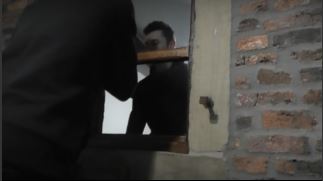
In order to make our film visually pleasing and interesting to watch, we used a variety of different shot types and camera angles. After researching different camera angles, I found that shots such as tilts and tracking shots are very effective in horror because it indicates confusion and a feeling that someone is stalking and watching the characters. Most of the shots that we used had a restricted view which meant that the audience could not see everything going on in the scene which helped to build up their anticipation and anxiousness as they didn't know what was around the corner.
One of the shots that we had to film was Jace at the top of the ladders leading into the attic. This shot was particularly hard as it was quite high up to film and the tripod didn't extend that far up. Due to this we had to balance the tripod steadily on a chair to ensure that it didn't fall. This shot was executed well as there is no shakiness in the camera and it is steady throughout. This shot helps us to establish the outside of the attic as it shows the worn bricks and old rickety door.
 Another shot we used was a birds eye view at a slight tilt. This shows the audience the layout of the table; the candles which lead to the Ouija board. The only source of light were the candles in this shot indicating isolation. This shot is used to build up the suspense as the shot moves from the candles to the Ouija board.
There is quite a slow pace at the start of our film as it is very natural and realistic. We used a slow pace during the start of the film to ensure that there was a contrast between the beginning and when chaos ensues. It begins to get gradually more fast-paced towards the end where the characters are conducting a séance to convey how chaotic and panicked the situation is.
We tried to ensure that our film had continuity throughout, which was very difficult throughout filming as we kept having to re-do scenes after we found continuity mistakes within them. I think our final film has good continuity.
It was quite hard adding sound to our film as we had many ideas that didn't work out. At the start of the film when the party scene is commencing, we were going to add some sort of pop music over the top, but we didn't end up finding any royalty free music which fit into the sequence. The pop music would have also took away the element of horror from that scene so instead we decided to place atmospheric music over the top to create a eerie ambience. We picked out a music clip from a website which we were going to using during the Ouija board scene, and we was deciding whether to scrap the music as it was corrupted and there was a loud beep every 10 seconds during it. In the end, we decided to make it work as it was a great piece of music for our film; we ended up cutting parts of the audio file out where the beep was and then fading the remaining audio c
lip together so that it flowed smoothly. This helped to keep the continuity as there was not noticeable breaks in-between each piece of sound. During this scene, we incorporated rhythmic editing which sped up the pace and helped to create a tense atmosphere which is needed in the horror genre. In the opening we had parts which were just left silent. This was used to show how to characters were reluctant and scared to speak which helped to convey the seriousness of the situation.
 For typography, we researched different fonts as we wanted to find the right font to fit the genre. We used a very simple font which still looks sophisticated and creepy. Because of the dark background and only candle light, we couldn't use a typical black or white colour as it wouldn't show up very well on screen. As red has connotations of danger, blood, death and rage, we decided to go with that as many horror films have the iconography of red and blood. We placed the title in the centre of the screen as that's where the viewers gaze is directed so it would draw more attention. We used the Serif font as it looks very ancient and old-fashioned and the simple style will allow the audience to read it more easily.
One of the shots that we had to film was Jace at the top of the ladders leading into the attic. This shot was particularly hard as it was quite high up to film and the tripod didn't extend that far up. Due to this we had to balance the tripod steadily on a chair to ensure that it didn't fall. This shot was executed well as there is no shakiness in the camera and it is steady throughout. This shot helps us to establish the outside of the attic as it shows the worn bricks and old rickety door.

 Another shot we used was a birds eye view at a slight tilt. This shows the audience the layout of the table; the candles which lead to the Ouija board. The only source of light were the candles in this shot indicating isolation. This shot is used to build up the suspense as the shot moves from the candles to the Ouija board.
There is quite a slow pace at the start of our film as it is very natural and realistic. We used a slow pace during the start of the film to ensure that there was a contrast between the beginning and when chaos ensues. It begins to get gradually more fast-paced towards the end where the characters are conducting a séance to convey how chaotic and panicked the situation is.
We tried to ensure that our film had continuity throughout, which was very difficult throughout filming as we kept having to re-do scenes after we found continuity mistakes within them. I think our final film has good continuity.
It was quite hard adding sound to our film as we had many ideas that didn't work out. At the start of the film when the party scene is commencing, we were going to add some sort of pop music over the top, but we didn't end up finding any royalty free music which fit into the sequence. The pop music would have also took away the element of horror from that scene so instead we decided to place atmospheric music over the top to create a eerie ambience. We picked out a music clip from a website which we were going to using during the Ouija board scene, and we was deciding whether to scrap the music as it was corrupted and there was a loud beep every 10 seconds during it. In the end, we decided to make it work as it was a great piece of music for our film; we ended up cutting parts of the audio file out where the beep was and then fading the remaining audio c
lip together so that it flowed smoothly. This helped to keep the continuity as there was not noticeable breaks in-between each piece of sound. During this scene, we incorporated rhythmic editing which sped up the pace and helped to create a tense atmosphere which is needed in the horror genre. In the opening we had parts which were just left silent. This was used to show how to characters were reluctant and scared to speak which helped to convey the seriousness of the situation.
 For typography, we researched different fonts as we wanted to find the right font to fit the genre. We used a very simple font which still looks sophisticated and creepy. Because of the dark background and only candle light, we couldn't use a typical black or white colour as it wouldn't show up very well on screen. As red has connotations of danger, blood, death and rage, we decided to go with that as many horror films have the iconography of red and blood. We placed the title in the centre of the screen as that's where the viewers gaze is directed so it would draw more attention. We used the Serif font as it looks very ancient and old-fashioned and the simple style will allow the audience to read it more easily.
No comments:
Post a Comment